Cannot show this message
Click here to open full message
POP3 message delayed: lxBf – Date: 09/30/2018 4:32:03 (wordpress)
Cannot show this message
Click here to open full message
POP3 message delayed: lxBf – Date: 09/30/2018 4:32:03 (wordpress)

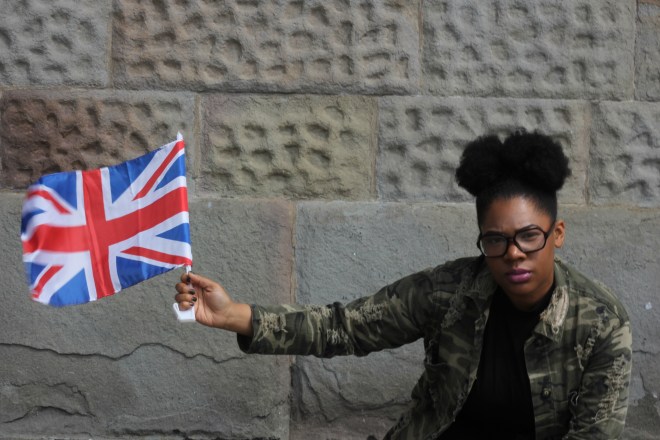
Our first interview was with Abi on the day before the General Election, 7th June 2017. Before the day we asked her for a written statement about herself, this is what she sent.
“I have just complete her Sociology and Criminology degree at the University of the West of England. For one of my assessments I created a short film exploring diaspora, culture, ethnicity history and legacy from the perspective of Black British individuals. I believe that this conversation requires a platform for engagement. Personally I’ve experienced my Blackness and my Britishness being questioned from people across a variety of diasporas. I am interested in sharing my views for this project because I recognise that as in today’s society identity is fluid and I believe this is a fantastic opportunity to discuss the fluidity of society and the impacts and implication that fluidity has on me as a young Black British women, entering into a new trajectory in life.”
During the interview Abi explored these issues at a deeper level, and so much more.

Abi is now looking to move to London and study for an MA.
Here’s the link to the film Abi made for her Sociology degree, titled ‘Union Jack Through Black Eyes‘ – https://www.youtube.com/watch?v=UES78IV0Lhg&t=475s
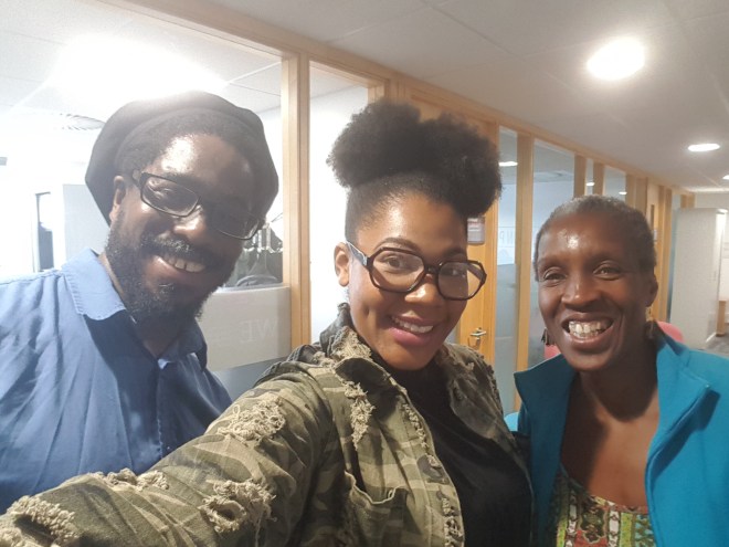
[L-R – Shawn Sobers, Abi Stephenson and Ruth Pitter]
Thanks Abi that was great! All the very best for the future!
Interview by Ruth Pitter (VOSCUR) and Dr Shawn Sobers (UWE)
Portraits by Shawn Sobers
Selfie by Abigail Stephenson
|
Sent from Outlook
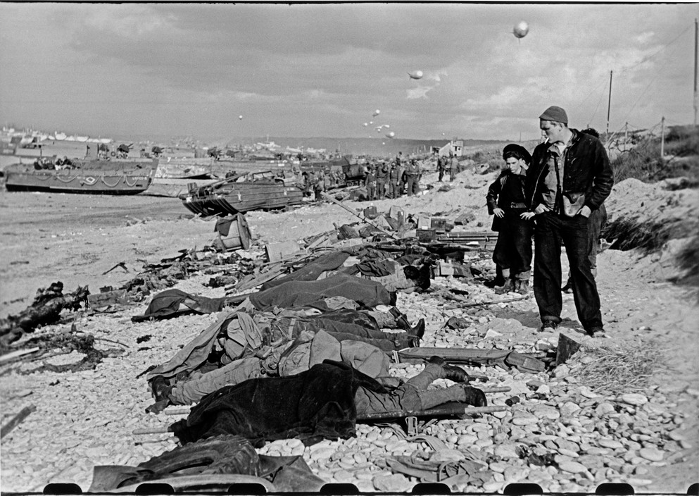
Lack of colour, contrast and a bleak sky leave the photo with a sombre initial impression: The only object easily drawn out from the background a body and soldiers. Strangely it seems to even add detail forcing us to take in the entire image. As the title suggests showing the past corruption of a French beach, recognised for family holidays. A seascape covered in harsh metal and corpses, overlooked by the “victor”. Bodies fading into the pebbled beach, when examined properly draw your mind back to the beach scene, sunbathers long lost to the invasion. The couple in the foreground show odd emotions for the scene – the first hands in pocket with a cigarette; numb to the suffering caused, resigned to his sins for the “greater good”, the other hands on hips frowning, as though clean-up is all that’s running through his head. All was for a good cause and in hindsight seemingly an understandable (though not acceptable) loss of life. Bringing this all back to the seascape is haunting for me – showing the power and flaws of those before whilst invoking such a positive comparative memory. Really bringing me into the photo to question past, present and future.
Adam Stoller
L1 Photography University of West England
This photograph is by French photographer David De Beyter. The majority of his work focuses on incorporating large structures and sculptures he designs and creates beforehand. This photograph in particular features three tiled buildings which appear to be half “sunk” into the ground. The location of the photograph is based primarily in a large field in front of some sort of small town which is lighting up the dark night sky with a warm glow.
What I admire most about this photograph is the lighting and composition. The distance of the structures from the warm background makes me feel disconnected and out of place, and the floodlight in the foreground emphasises this by highlighting the out of place buildings in a light which juxtaposes with the tones in the sky behind it. I find this image to be quite thought provoking as it raises many questions about the narrative behind it as well as leaving room for interpretation. The fact that it was shot during night time also adds to the dark and moody atmosphere by forcing you to focus on the remotely lit and disconnected abstract structures in the foreground.
HARRI NEWMAN
Jake Banks
L1 Photography, University of the West of England
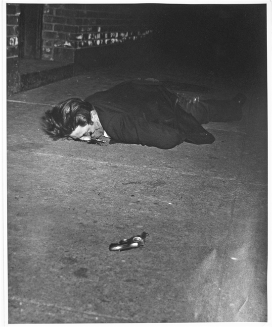
Murder in Hell’s Kitchen is a photo that makes me think for a multitude of reasons. The first reason being that it is such a macabre image; it’s a man who has been shot in the face. Another question the photo makes me ask is, who is this man? If I didn’t know the title of the photo I would still be able to tell that he is a murder victim because of the gun that is on the floor facing towards him. The photo kind of desensitises me to the fact that the victim is dead because it’s shot in black and white; I know that it is blood on the man’s face, however, it just looks like a black mark because I cant see any of the red tones. I like how the photo fades to black in the background, engulfing the man’s body and it gives a sense of the unknown which is a good metaphor for death. On the flipside of that, there is quite a lot of detail and light in the foreground from Weegee’s perspective.
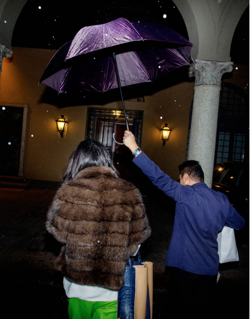
I find this photograph by Alex Majoli very interesting, this is because I find it difficult to pick apart who and what is in the image. Looking at the female I find it hard to tell on whether she is an upper class woman or a prostitute, her clothes could represent both as fur could be seen as trashy or wealthy, but then her lower half and her messy hair shouts out cheap. What throws you is the gentleman who could be portrayed as I driver or a doorman sheltering and escorting the lady to a building, where assumptions could be made of either a fancy hotel or a half decent motel. I also feel that the way the photograph is taken could play a big part in the representation of the image, with it taken at night, and the woman appears to be ‘coming back’ from somewhere, it can be assumed that she is some sort of escort/prostitute returning from work. Majoli used an artificial flash to take this photograph, this creates a dramatic effect and draws a lot of attention on to the subjects, I think this adds even more mystery to the image as it’s as if Majoli is trying to say something but I can’t seem to figure out what.
Holly Ellis
Louis Higgins
L1 Photography, University of the West of England.
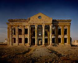
When I first looked at this image, I was immediately drawn to the fantastic light in the photograph. The golden aura around the building gives it an almost romantic feel, reminiscent of renaissance paintings. After this aesthetic had worn off I was left to study the image in greater detail. The photograph is essentially of a ruined governmental building, however, as you study it closer you realise that its downfall was not from neglect but was the effect of the attrition of war. Bullet holes are clearly visible in the buildings’ walls, and there is no glass left in the windows. I love this use of juxtaposition by Norfolk. He grabs our attention by presenting the regal building in a stunning natural light, but as we start to dissect the image we are left feeling the effects of a war that has ravaged a country. I feel this is an incredible way to present a very delicate subject to his audience. I almost felt guilty for viewing the image as beautiful, because really what he is presenting to us is the drastic effect that wars have on countries.
https://www.instagram.com/p/BDuL_2mve1a/?taken-by=caesarsebastian
On 18 September 2016 at 19:19, sam wexham <samwexham96> wrote:
This is the image I have chosen by a photographer called caesar sebastian.
This image caught my eye when I first saw it and made me think. As to me this image asks questions and makes a lot of comparisons creating contrast in the image to the viewer. This pink contrasts with heavily man made pink creating a contrast between not only the two styles present but the views, this man made bright pink paint covering up her nipples and groin, like this image has to be censored by modern society to make it acceptable or appropriate, but why isn’t our own body appropriate? This to me shows modern life about made up stereotypes of whats wright and wrong in the public eye.
It has a very dreamy look to it created by using a low aperture with soft light and colour, making you have complete focus on the girl drawing you to her. Her whole relaxed posture and star at the camera make you think that she has a special connection with the person shes looking at as she seems completely comfortable in there presents.I think the pink paint also creates a really cool layer effect to the image as well as contrast which draws your eyes further.
Sam Wexham
L1 PHOTOGRAPHY UWE


